What Makes A Good Research Paper? Making A Paper Look Right — Gestalt

What Makes A Good Research Paper? Making A Paper Look Right — Gestalt
If I have learnt one thing in writing, it is that the introduction is the most important part of any written output. It is there that you layout your thoughts and define why you are covering things. I also learnt that a diagram at the start really helps the reader place things in context. After reading many PhD thesis’, I know that the main weakness within them is that the Introduction says little about the work, which then often makes the thesis difficult. So let’s see some research work that possibly verifies this approach, and where diagrams early on in a paper help its acceptance within the peer review process.
A core part of being an academic is to publish papers. It is the thing that we are often measured on. When we recruit we often look at the quality rather than the quantity of someone’s research output. One good paper which contains a strong scientific contribution is often better than a whole lot of papers which add little to current work. Personally, as a reviewer, I most often reject papers with the following ordered list:
- Poor English and grammar.
- Lake of focus and no definition of the problem statement, and how paper addresses this.
- Little contribution to existing methods.
- Lack of definition of the key contribution.
- Lack of results.
- Lack of formality.
- Poor definition on figures and diagrams.
- Poor coverage of the existing literature.
Some reviewers can even just quickly look at a paper and decide that it is a bad paper. So can a machine learn how to quickly review a paper, and thus for us to determine the key factors that reviewers look for? For this we turn to new work on a classifier based on the visual appearance of the paper — defined as the gestalt of a paper [here]:

In their work, they took a wide range of previously accepted and rejected papers, and created a classifier that could reject 50% of the bad papers while only rejecting 0.4% of the good papers. Such a system — if it could work — would considerably reduce the workload of reviewers.
Within the work the authors define previous work in classifying research papers:
- Administration. This analysed the basic administration process around the submission of papers such as the violation of anonymity, poor formatting, and being clearly out of scope. The correlation here is that it is likely to be that weak research teams will have a poor experience of the peer review process and make simple mistakes in their submission. A strong research team, though, is likely to have good processes for making sure that the papers are properly reviewed and also against fit the requirements of the submission system. As an editor I get to see some weak submissions, and which have little chance of ever being accepted. A one minute glance at a paper can tell you if it has little chance of success, and poor papers will often be rejected at this stage for their poor compliance with the submission system.
- Text-based methods. These involve automated ways of grading a paper and could involve checks for grammar scores, spelling errors, usage of maths, usage of keywords, and so on. I have personally seen many reviews where the reviewer justifies their rejection on the basis of the poor grammar used and/or typos, I think this type of method has a solid base in classifying papers. An editor who sees a whole series of typos in the review comments, will often think the worst of the paper.
- Visually-based methods. These involve methods that analyse the look and feel of the paper.
The methodology for the new method used papers accepted for nine conferences hosted by the Computer Vision Foundation (CVF). Unfortunately, they did not get access to the rejected paper, but used the ones which did not appear in the main conference, but were accepted for workshops.
For their method, the used the PDF2Image program to convert papers into an image for a 2x4 grid (for the first eight pages) and then compared workshop paper layouts to conference ones [dataset]:

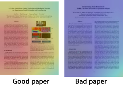
After training Res-net-18 [here] for papers from 2013 to 2017, they then predicted accept/reject rates for 2018, and found that they were able to correctly reject 1,115 bad papers and only miss four good papers (out of 979 good papers). In the work a bad paper looks like this:

and a good paper:
Overall the placement of diagrams was often key within the classification, and especially putting an overall contribution graph at the start of the paper. The usage of tables/plots considerably helps the success of the paper, too. In the following we see the usage of an overview diagram on the first page:
The authors of the paper define that the paper may be difficult to read if there is no illustrated diagram on the first couple of pages.
Conclusions
The number of papers submitted to quality journals and conferences often increases by the year, and cannot keep up with the number of good reviewers. And so we may see the rise of automated systems which reject papers without even going to review. For poor English and grammar, this can be easy, but for the visual look of the paper, it might be difficult to justify, especially if we miss an amazing break-through. One of the best examples of this was when Ralph Merkle’s paper on public key encryption was rejected because it didn’t have any references [here] — as there were no other papers to actually reference.
And so, get those introductions right and draw a picture which guides the reader into your work. Here are my Top 25 tips for a PhD thesis: