Research Quality Gives Better Student Experience … Not Proven!
Research Quality Gives Better Student Experience … Not Proven!
Better Teaching Does
In government circles, there is a feeling that the more you invest in research at university level, the higher the quality of the teaching will be. Personally, I see no such link, in that high-quality researchers often buy themselves out of teaching, and where universities can put their resources into research rather than teaching. There is also no guarantee that what you invest in, in your research, will filter through into teaching.
From what I see too, there is good and not so good research that is undertaken, and, in some cases, the linkage between research topics and the topics that need to be taught to students is perhaps not always as strong as it could be. The UK, perhaps, his heading to a two-tier system of academics who are research-active or teaching-active, and the days of the great teacher who is highly research-active are perhaps receding.
So what evidence is there? Well, my little open-source bots have been grabbing data from The Times University 2016 survey [data]. First, we will plot student experience against teaching quality [here][Web page]:

and we see a strong correlation (R-squared=0.999) and:
STUDENT EXPERIENCE (%) = 0.727 * TEACHING QUALITY (%) + 25.122
For the linkage between research and teaching quality, it is a fairly patchy correlation [here][Web page]:
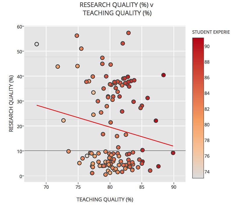
If fact there is a slight downward trend where increasing research quality gives lower teaching quality. If you want to analyse your own it is here.
Computer Science
Now if we drill in Computer Science, we can plot teaching quality against research quality [here][Web page]:
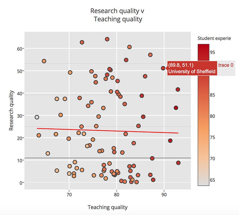
We can see that there is not a strong correlation, in fact, there is a slight downward trend in research quality and teaching quality goes up. So is the student experience linked to teaching quality. Let’s plot [here][Web page]:

This gives an R-square value of 0.995, which is a strong correlation, and we can map as:
Student experience = 0.745 * Teaching quality + 23.141
For research we get a far more random plot [here][Web page]:

While there is a general upward trend, we see that it is not a strong correlation. When it comes to the student experience and graduate prospects, it can be seen that there is a general upward move, there is a great deal of variation across the universities [here][Web page]:

Finally, we can plot as a bubble for three parameters [here]:

You can analyse you own here and here:
Conclusions
League tables are flawed, in that they think they can cover a whole entity with a single metric, but they do give us an opportunity to look at the linkages between research and teaching, and it can be seen that the better you teach, the better the student experience, and that better research doesn’t always lead to an improved student experience. An institution must always put students before research, as those are the most important things. Some universities manage to do this well, but others struggle to juggle resources.
Personally, I don’t like league tables, as it really doesn’t reflect the amount of input that each academic, each school and each university puts into the student experience. There’s good and bad everywhere, and to band a whole school or a whole university with a single metric is flawed. As an external examiner, I have seen amazing work, and weak work, and you’ll find this everywhere. There are some people who deeply care about the student experience, and who do great research, but there are others who are not so caring. No matter where you go, you’ll find both types.