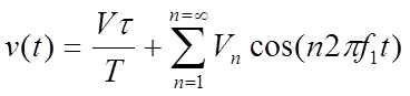
The signal shape of most interest in data communications is the repetitive rectangular pulse. With a pulse we see a sin(x)/x response:
Analysis of pulses |
Theory
The signal shape of most interest in data communications is the repetitive rectangular pulse, as shown in Figure 1. It is defined by its amplitude and its duty cycle, which is the ratio of the active time of the pulse (t) to the period of the waveform (T). The duty cycle is thus given by:
Duty Cycle =\(\frac{t}{T}\)
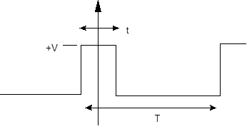
Figure 1:Pulse
The time-based repetitive pulse waveform is given by:
the amplitudes of the harmonics is given by:
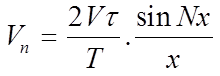
where:

This has the response of a sin(x)/x function:
Source code
The following outlines the Python code used:
import matplotlib.pyplot as plot
import numpy as np
import sys
from scipy import signal

file ='1111'
freq=2
duty=0.2

if (len(sys.argv)>1):
        file=str(sys.argv[1])

if (len(sys.argv)>2):
        duty=float(sys.argv[2])

if (len(sys.argv)>3):
        freq=float(sys.argv[3])

Fs = 100.0;  # sampling rate
Ts = 1.0/Fs; # sampling interval

t = np.arange(0,2,Ts)


y = 2.5*signal.square(2 * np.pi * freq * t, duty=duty)+2.5


n = len(y) # length of the signal
k = np.arange(n)
T = n/Fs
frq = k/T # two sides frequency range
frq = frq[range(n//2)] # one side frequency range
Y = np.fft.fft(y)/n # fft computing and normalization
Y = 2*Y[range(n//2)]

fig,myplot = plot.subplots(2, 1)
myplot[0].plot(t,y)
myplot[0].set_xlabel('Time')
myplot[0].set_ylabel('Amplitude')

myplot[1].plot(frq,abs(Y),'r') # plotting the spectrum

frq =np.delete(frq,0,0)

y1=2*5*duty*np.sin(np.pi*duty*frq/freq)/(np.pi*duty*frq/freq)

y1=np.insert(y1,0,5*duty)
frq=np.insert(frq,0,0)

myplot[1].plot(frq,abs(y1),'--b')
myplot[1].set_xlabel('Freq (Hz)')
myplot[1].set_ylabel('|Y(freq)|')

#print frq
print ('Freq = 0 Hz\t',str((y1)[0]))
print ('Freq =',frq[2*freq],'Hz\t',str(abs(Y[2*freq])))
print ('Freq =',frq[4*freq],'Hz\t',str(abs(Y[4*freq])))
print ('Freq =',frq[6*freq],'Hz\t',str(abs(Y[6*freq])))
print ('Freq =',frq[8*freq],'Hz\t',str(abs(Y[8*freq])))
print ('Freq =',frq[10*freq],'Hz\t',str(abs(Y[10*freq])))
print ('Freq =',frq[12*freq],'Hz\t',str(abs(Y[12*freq])))
print ('Freq =',frq[14*freq],'Hz\t',str(abs(Y[14*freq])))
print ('Freq =',frq[16*freq],'Hz\t',str(abs(Y[16*freq])))

h1=y1[0]
h2=y1[2*freq]
h3=y1[4*freq]
h4=y1[6*freq]
h5=y1[8*freq]
h6=y1[10*freq]
h7=y1[12*freq]

yupdate = h1+h2*np.cos(2 * np.pi * freq * t)+h3*np.cos(2*2 * np.pi * freq * t) \
+h4*np.cos(3*2 * np.pi * freq * t)+h5*np.cos(4*2 * np.pi * freq * t) \
+h6*np.cos(5*2 * np.pi * freq * t)+h7*np.cos(6*2 * np.pi * freq * t)

myplot[0].plot(t,abs(yupdate),'--g')

f1 = file+".svg"
plot.savefig(f1)

f2= file+".png"
plot.savefig(f2,format='PNG')

plot.show()
print ("Saving to ",f2)